Postcard development.
25.4.14
Brand The Boring: Range Of Products
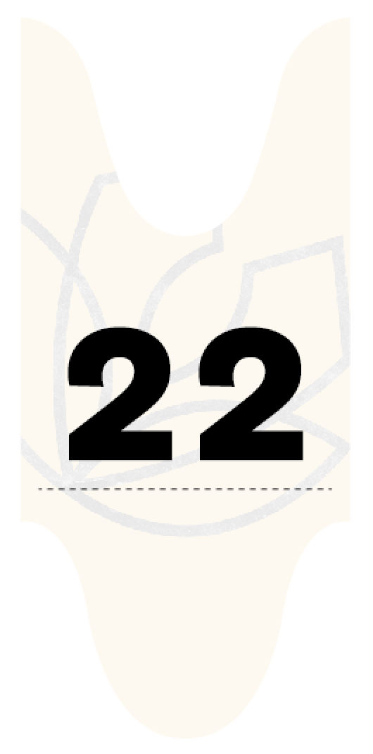
The range of products for the identity of the 'city farm', of which I have turned into a vegetable garden, are kept simple and focus on enticing copywriting, and word play. The will act as a take away promotional product that would be given to the customer at the till, and would be free to take around the premises. They also state the company ethos, of which I aimed to sound friendly and personable. A simple ticket design has been added to the range to make a ticket system personalised, and because they would be given to the customer every time they would shop at The Veg Loft, it would be another continuation of the branding, also making the brand feel high quality.
Brand The Boring: Development: Logotype
The concept that I wanted to centre the design around for the 'city farm' would be a vegetable garden that would be readily available to New Yorkers everyday, when they choose to go to the loft and pick their own crop. I wanted the logo to emulate the letter 'v' for veg, and also appear as a vegetable, or organic shape. I also wanted to make it feel contemporary, constructed with both straight and curved linear composition, blending the urban and organic elements the make up this company.
I felt that the bold line would simply make the logo stand out, and again, feel contemporary, with the mustard colour making everything stand out, being consistent across the range of products.
I felt that the bold line would simply make the logo stand out, and again, feel contemporary, with the mustard colour making everything stand out, being consistent across the range of products.
2.4.14
Cabin Fever Magazine: Final Spread
Cabin fever, final spread. I managed to finish the magazine, and send it off to doxprinter to be printed. I chose to get it printed as a perfect bound magazine.
Subscribe to:
Comments (Atom)


